Just came across this free online magazine. It's called Carne and they are only on there 3rd issue. Im already excited to see more. Its full of some really inspirational images graphic design, illustration, paintings, photography. It's all in their, check it out.
http://www.carnemag.com/
Thursday, May 6, 2010
Tuesday, April 13, 2010
Design for collaborative book

This is my design for a collaborative book by our GRD3200 class, inspired by "Dream".
Monday, April 5, 2010


Wednesday, March 3, 2010
Caleb Everitt
One of my favorite designers has just updated his website with more recent work. All of it looks great! I love his subtle yet very affective design approach with the use of simple and minimal design elements.
http://www.caleboweneveritt.com
http://www.caleboweneveritt.com
Monday, January 25, 2010
Creative Brief for Breathe
Creative Brief
A. The company is “Breathe”
B. The goal is design and build custom bicycle frames.
C. Competition to this type of company is large scale bicycle manufacturers.
D. Strengths of this company are that there is a personality to the brand. This brand will say something about an individual using the product. The brand strives to create and make their clients individual ideas possible.
E. Areas of improvement for the company: first and foremost to form an identity. The company is still getting off the ground.
F. 5 buzz words as is:
Experience, relationship, custom, dream, environment.
5 buzz words in redisgn:
Elite, Simple, Clean, Status, Bond.
G. Target audience is the road cycling enthusiast. Age ranging from 20 to 60 years of age. There is no one particular type of customer as the brand wishes to cater to anyone and everyone who is in the market for a bicycle that meets there exact needs. The cycling world consists of many many different types of people all from different backgrounds with this one thing in common.
Monday, December 7, 2009
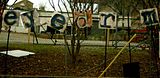
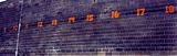
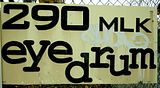
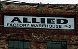
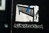
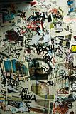
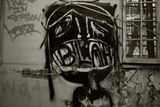
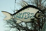
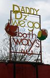
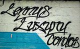
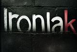
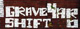
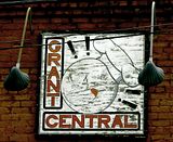
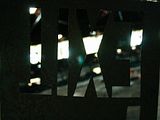
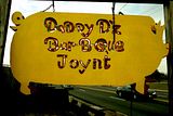
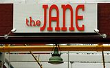
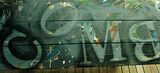
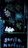
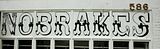
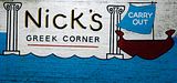
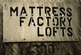
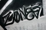
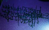
Final 30 "Fotos"
In doing this project I wanted to showcase things that are in my everyday surroundings. Signs that I felt had a unique quality about them that the average passer by might take for granted or overlook completely. My focus was more on handcrafted or hand painted signage. I began photographing a lot of graffiti and from that was drawn to any sign that looked painted. The two are extremely similar one just so happens to be illegal.


Wednesday, September 30, 2009


Subscribe to:
Posts (Atom)